One of my favorite examples of the power of a photograph for nonfiction impact comes from an article about the lightest metal on Earth.
Now, I want to know, who had the brilliant idea to put that metal on a dandelion to show it’s lightness? A drawn illustration of that metal on top of a dandelion would not have done the same thing. You need the photo to feel as if you are experiencing that moment, the metal pressing down on the dandelion fluff, the fluff holding up the extremely light metal.
Photography is powerful even in an age when we admit that some photos can be manipulated with image processing programs. (Understanding the image fully is also easier if you have had contact with real dandelions, i.e. nature, the greatest source of metaphors that reach beyond cultural and language barriers.)
If Common Core includes deeper study of context and richer critical thinking, then a study of photography in nonfiction could be a rich unit, indeed. To that end, I thought I’d share some of the things I’ve been thinking about as a professional photographer creating images for nonfiction books for children and adults.
 |
EDITORIAL PURPOSE IMPACTS HOW YOU PHOTOGRAPH A SCENE
Here’s how I know that purpose matters. My husband is coauthoring a field guide to nature of the midwest for Houghton Mifflin’s Kaufman Guides. As we traveled all over the Midwest to dunes, prairies, forests, and bogs, I soon learned that not just any photo will do for a field guide that promises to help people identify animals and plants.
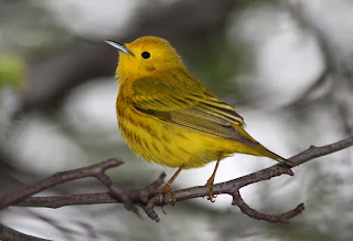
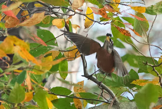
His images for the field guide need to be clear and complete, showing every aspect of the lizard, insect, or mushroom to best effect for identification purposes. No bush in front of the right foot. No tree bisecting the image of the deer. I call it “Egyptian tomb painting” school of photography. All limbs must show, just like those wonderfully awkward elbows and arms in ancient Egyptian scenes. You may think you have great photos of animals but if you look through them I bet you’ll find that 99% of them are useless for field guides.
 |
| Yellow warbler, tail hidden, not useful for field guide |
 |
| A field guide worthy photo, all relevant field marks showing |
I’m happy to find raindrop-covered creatures for my rain book (Raindrops Roll, 2015). But that’s not so great for Jeff’s work on field guide photos. Raindrops reflect light, making the image spattered with polka dots. A smattering of pollen changes the color of a hummingbird—not so great for i.d. If you show a photo of an animal with stripes of mud on it, people might think that it should always have stripes. Some of these variations can be altered in editing software. But, then again, should you show a leaf as is, with all the caterpillar bites in it? Or do you fix it so people won’t think that species of tree has every leaf “holey?” These are the questions that plague field guide photographers. What image will represent the species?
 |
The other thing is that the photos are keyed out, so it helps to photograph things on uniform, contrasting backgrounds. So Jeff carries around a flag-like piece of cloth which I sometimes have to hold, seemingly forever, behind a plant until the wind stops making the plant move so Jeff can get a good shot. This helps make sure all the needles on a tree will be distinct from the background. Yes, purpose matters.
CHOICE OF VIEWPOINT MATTERS
Nonfiction authors and illustrators make choices. In my school programs I show kids why this is important in photography. In the first slide I show them a broad view of the stunningly lovely wings of a polyphemus moth. Ooh! Aahh! the audience coos. Then I show them a closeup of a polyphemus moth face and its hairy, tarantula-like legs. Eeeuw! is the common response. Yup—same moth, same day, different angle. Photographers can make you fawn over an animal or fear an animal. It’s all in the visual choices we make. The same goes with writing. When you choose a metaphor, you are putting an image, albeit made with words, right next to your subject. Say a spider just covers a medium pizza and people imagine that spider ON their pizza. That makes them feel a certain way. Excited or grossed out. Depends on the audience.
FRAMING MATTERS TO MEANING
No, I don’t mean the frame around the picture although, yes, the setting of a photo in a book is important. (Book design impacts meaning.) No, I’m talking about psychological framing—the way we digest words and images. Framing is a tad deeper than the impact of viewpoint and metaphor I discussed above. This is a chewy topic for older grades.
Basically, framing refers to the fact that words and photos do not live on a blank page that floats in space. A single seemingly innocuous image can activate a whole “frame” of beliefs/thoughts about a topic. Then, when you see the next word or image, you’re set up to believe it, not believe it, or take it in an entirely different way. Just imagine your whole lifetime of experience with an image of a dark alley, a snake, an American flag, a robot, a baby-in-arms, and such.
Here’s how one program describes the concept.
Framing can be productive in good and bad ways. On the scary side, you don’t have to be directly insulting or racist or actually say someone is guilty. You just flash up an image or use a word that brings the emotions and thoughts of fear/guilt/protectiveness. Those previous images or words can totally change a person’s viewpoint of seemingly neutral facts or statements that follow it. Alas, this kind of “framing” is very sophisticated. Its work goes quite below the radar even for people who are educated and think they control their reactions to things. It’s used a lot in political ads.
I’ll never forget the course I took at Duke: Media Power Politics. That brilliant, wild professor blew our minds. He showed us how newscasts use music, color, lighting to make their newscasters look authoritative, how statistics can be manipulated for best impact in advertisement, how disturbing news images then lead us to the happy solutions—the commercials, where you learn that although you cannot solve war, you can smell better if you buy this soap. He showed us how the Nazis used patriotic films and images to set up the anger and shift the public’s view of certain groups.
Perhaps framing and media power politics don’t directly impact the way I take photos. But it certainly impacts how I read and watch TV. Being a savvy digester of images is going to be just as important as being a critical thinker about words if you care about nonfiction, now and in the future. The more students learn about it, the better they’ll be at sorting truth from manipulation.
Next month I’ll be discussing some more aspects of photography, such as how to enrich photos with layers that give additional educational content beyond the main focus of the images. (It’s sort of like what illustrators do with drawing or painting when they include extra symbols, words, and seek-and-find elements.) For now I’m going right back outside to see if I can photograph those warblers that were eluding me this morning. Good day, INK folks!
 |
| Sometimes a little blur can convey action. Not great for field guide but good for the feel of the scene. |


6 comments:
Thanks, April, for a peek into the "other side" of creating our books. and I like your cliff-hanger ending....
What a pleasure to read your blog. Photographs and nonfiction = a very fine marriage. The craft of photography is a complex art form not easily understood. Your descriptions, revelations and explanations brilliantly add to the conversation about interpreting nature through art and nonfiction. So thanks for today. I learned a lot.
What a great post, April. You made me think about some things differently today.
What a great post, April. You made me think about some things differently today.
Hi
Nice one! I like the outfit of the characters. Wish i could do the same thing too but im not that techie.i like the outfit of “from farmer to warden”.. really interesting.<a href=" http://dandjstudio.com/”>photographer Seattle</a>
Fascinating ideas, April. Thanks for sharing them.
Post a Comment