Showing posts with label photography. Show all posts

Wednesday, February 19, 2014

Photographing Beyond Magenta


After four years in the making, I’m absolutely thrilled to announce that my new book, Beyond Magenta: Transgender Teens Speak Out has just been published. I’ve been waiting for this month with anxious anticipation. Now that it's here I’m walking on air, soaking in all the love, care, and respect sent out to the six teens that participated in the book.

Usually my YA books have black and white photographs peppered throughout the text. But this time they are mostly in color and are a finely integrated part of each chapter.

Each teenager in the book is individual and distinct. They know who they are and what they need. They certainly know who they are not. My role was to represent these awesome kids through words and photographs.

One person in the book preferred not to have photographs at all, and another person’s mother did not want her son’s face shown. That left four chapters that needed separate photo essays.

The first teen I met was Jessy, who had just begun taking hormone therapy. I thought, and he agreed, that it would be interesting to photograph him every two weeks as his transition progressed. This is the first photo, taken with my cell phone because it never occurred to me that our first meeting would include a photo shoot. I referred to Jessy’s photo essay as  “Transition.” They are very casual and mostly shot in natural light.


This is from the final set of photographs of Jessy's transition at the time I turned in the book. In my view - and the art director’s - camera and lighting are somewhat better than the one with my iPhone.


The second person I interviewed was Christina. Christina loves to shop and is very, very good at it. I trailed along, feeling quite dumpy, as she methodically, elegantly went through every rack. We did two shoots, one when she was a strawberry blond and another when she was a brunette. This essay is called “Shopping Spree.”


Cameron, the third photo essay in the book, did a great job explaining gender fluidity. We decided that it would be best to “show AND tell.” I set up my studio with a crumpled white cloth background and large strobes that I usually use when photographing dancers. Cameron carried bags of clothing to my sixth floor walk-up studio. We did two sets of studio photography. This is “Variables.”


Nat, the fourth essay, is a fine artist and a wonderful violinist. We wanted to do something that married intellect and art. And that to me is Black and White photography. I suggested that I photograph them [Nat’s pronoun of choice] in the tradition of André Kertész, 1894 -1985, a photographer whom I greatly admire. Kertész focused on patterns, angles and space. Nat and I went up on the High Line early in the mornings when all the tourists were asleep in their beds. We did our interpretation of a Kertész photo essay. It became “The Long Road with Musical Interludes.”


The last chapter is devoted to Luke, [not his real name] a marvelous poet and actor. Luke’s mother did not want her son’s real name or face revealed in the book. When Luke is onstage he’s a whirlybird.  So I slowed down the camera and let his movement compliment his personality. Although his is not a true photo essay, the images are not like the other chapters.


This structure is not explicitly described in Beyond Magenta. But it's layers like these that add (subliminal) depth to our books. No one knows it, unless posted, but it's there. One of the pleasures reading INK is to learn the backstory, the layers, that go into creating books. 


I do love writing. I love being an author. But let me say, it feels really, really good to be back behind the camera. I continue to photograph Jessy and Christina as they grow into stunning adults.

Wednesday, December 18, 2013

Photographing Dancers - Really


A month ago, November 13, April Pulley Sayre wrote a post about photographing nature, Common Core and Nonfiction Photography Part I. (Part II was posted December 11.) As another photographer-INKer, I’d like to continue the discussion by writing about photographing dancers. Capturing dance is much like photographing nature. Every part of the dancer's body must be, as April wrote, “clear and complete.” This is especially true when it comes to the very strict and formal lines in ballet. The shapes dancers make must be perfect, as defined by balletic rules. If even one finger is not in the correct position, the photograph is useless. Formal lines and movement have a little wiggle room, but that is usually the choreographer's domain. As examples, I will use photographs taken for the book, Beautiful Ballerina, by Marilyn Nelson. In order to illustrate dance books I follow the 1-2-3 Rule:
1.  Perfect ballet form
2. Recreate the choreographer’s vision or style
3. Visually express the meaning behind the writer’s words.
 You won’t find these rules on Google. I just made them up. But this is pretty much what’s involved. As you might imagine a heap of dance images end up under the delete button. Here’s an example:

Notice the ballerina’s foot resting on the barre. Wrong. The foot must be slightly elevated. Although I loved the emotional connection captured in the photograph, it would never pass the choreographer’s veto power. Here’s the image reshot with a correct line.

 [The little ballerina gets a free pass because she’s only four.] This image ended up in the B list  – I didn’t have the heart to delete the two entirely – because the two dancers at the barre didn’t fit Marilyn’s words, rule 3.

HOW PHOTOSHOP CHANGED IT All - & Opened a Can of Worms
Fortunately, today’s technology gives photographers some space to make mistakes. For this book I used large, white, diffusion screens and strong strobes to capture dancers in motion. While going for the dancer, the background often turned into an angular mess that overwhelmed the picture. With the help of PhotoShop, I got rid of the distracting background elements. Here’s what the original photograph looked like.


 Here’s what was sent to the art director.


 So here's the question ... Is a retouched, cropped, straightened photograph fact or fiction?
 As a budding photographer I would practically have a nervous breakdown if anyone cropped or tinkered with my black and white photographs. Now I’ve come to appreciate the fact that technology can help make images more real.
The curtain in the photograph above had splotches on it. Can you see them? They look huge enlarged in the computer. If I kept them in, they would be a distraction. So out they went. In order to show the entire body of the dancer I sometimes ended up with slanted curtain tops. By taking the dancer out of her environment via layers in PhotoShop, I was able to get rid of the angled spotted curtain and keep the focus on her. Is it still real? More real?
In the middle of shooting the book one of the dancers arrived with a small canker sore on her lip. It was hardly noticeable. But under powerful lights, and a camera that records every little pore, it looked enormous. Out, damned spot! Out, I say! [I just saw Macbeth at Lincoln Center.] The book was about ballet, not pimples. I PhotoShopped it out. Then I decided to get rid of the curtain and slightly change the background colors. Does that mean the image is less true than had I left it in?


Like research and writing, photography includes choices. What to leave in/take out?  We make choices while creating narratives, building arcs, and describing a subject. I don’t know about you, but when I do an interview, the subject usually has repeat quirk words such as, “you know,” “okay,” “right.”  Right? I once counted seven “likes” in one transcribed sentence. Leaving in those involuntary quirks detracts from the read. The quirk then becomes the subject rather than what the person is saying, or who the person is. Sometimes I leave one or two “you knows” or “likes” scattered throughout a chapter for flavor. Just like sometimes I leave in a small pimple or two. But I take out blemishes, visual and syntactic, because I don’t want the distraction. 
Another element when photographing dancers is rule 2. The image must, must, must reflect the choreographer's unique vision. Arthur Mitchell, the founder of Dance Theater of Harlem, where the book was shot, insists that his dancers have perfect, classic, balletic lines. His view is what makes this book distinct from other dance books I've done in the past.
One more thing ... rule 4. After all three rules are met, the photograph must also represent the vision of the photographer. For me dance is not just about body and form. I want to show the emotion, the individual je ne sais quoi, that turns dancers into artists. Adding to the emotional content is historical context in at least one image per book. No one notices this but that's okay. Arthur Mitchell became famous as a lead dancer for George Balanchine’s New York City Ballet. As homage to Mr. B, the first photograph in the book had to be a ballet shape that he created. 

Next February, I plan to write about photographing people for my new book, Beyond Magenta: Transgender Teens Speak Out.  
Happy holidays everyone. May we dance into a beautiful New Year.

Wednesday, December 11, 2013

Common Core & Nonfiction Photography Part II

PHOTOS CAN HAVE LAYERS OF CONTENT, JUST AS GOOD DRAWN ILLUSTRATIONS DO. 

You know all those little fun bits that illustrators tuck into their drawings and paintings? The birds that shows up in every illustration, the signs on every door, the meaningful numbers that make sense when you read to the end? Well, those features are a tad harder to plop into a photo. But photographers can seek to add those extra, nourishing elements, too, if they know ahead of time they are working on a book.  

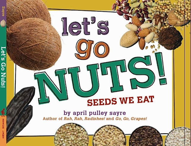
When I photographed Rah, Rah, Radishes, I was just beginning to hone my photography and content in this way. For that book, I tried to photograph at booths that had signs that brought forth good math content, nutrition and farm messages. No, I did not write them. Those signs were there. Nonfiction photography is a matter of choice, as  my thousands of unused photos can attest.  But for the subsequent book, Go, Go, Grapes, I did more still lifes, here and there, to fill in produce that I could not find in the same photo in the markets and small stores. 


Yet I didn’t really understand the power of what I could do until I was in an IKEA in Chicago selecting some props for Let’s Go Nuts: Seeds We Eat. Perhaps it’s because I have so many math teachers in my life but when I saw the red measuring cups and spoons, I thought: AHHHH! Yes! That’s when I realized I wanted to add cool stuff whenever possible...math fractions, quantities, geographic context, cultural context. Things that would make bounce readers to fun activities.  I have only begun to push in this direction. It’s a matter of trial and error and learning what works for audiences at this young level. It’s not what a really cool graph can do for synergy but it is layering some more deliciousness into the work. 

Measuring cups are in the book!


After the measuring cup moment, I kinda went, um, nuts, organizing photos with extra content not covered in the text: extra information about patterns, foods, and eating local foods. (Note: only some were organized in this way. Many were photographed onsite at the market or store.) But if you look closely you will find mathematical patterns of repetition and grouping. 
Colors and patterns for early childhood teachers may use

At times, I inserted food made from the focal seed into the photo. Sometimes I overdid this. The cutting room floor is littered with photos I carefully arranged to show both coconut and coconut milk, both red bean and Chinese red bean bun and mung bean pastry, and the like.  (But even in the final book there are some of these extra bits for readers who want to extend. That page of rices has rice pastas of many sorts in it.)
Photo experiment discarded. Bean rolls, however, not discarded! Yum!
Experiments for various photographs
LAYERS OF CONTENT IN PHOTOS IN NATURE

Despite my journey into food chants, most of the photography I do is in the wild: out in nature, not in still lifes. But those book can have “extras,” too. Sometimes you find them by accident. Thanks to digital cameras, we can take thousands of photos and sometimes hit ones that have those “teachable nuggets” for a book or slideshow. Last week I was sorting hundreds of seagull photos when I noticed this one with a band.

Soon I found out that there’s a government site www.reportband.gov you can contact to report bird bands. Within a few days, they’d sent me this nice certificate and information that my bird, photographed at the ferry near Williamsburg, VA, had been banded in Quebec!

That was a lucky break. Mostly, layers in photography develop from sweat and time. You just have to be there, and stay there, and stand there, and walk there, until the right moment happens. 


For my latest book, Raindrops Roll, which will be out in 2015, I spent five months photographing raindrops. Raindrops on butterfly antenna, raindrops on soggy bees, raindrops on seedpods, and frogs, and the like. The text is simple. The bulk of what I wanted to say about scale, moisture, mass, weight, mushrooms popping up after rain and so on, will have to be carried by the photos because the editor and I edited some of that text out of the book. The photography took endless stomping in rain-filled boots, dripping with raindrops and my hair a rippled hygrometer from being out in humidity. I loved it.  A bit can be expanded in the endmatter but my hope is that the photos will carry the message the young, carved-to-the-bone text cannot contain. 
One of the things about picture book text and illustration is the immense love and care (obsessive need for perfection?) that goes into it. For illustrators, including photographers, the work takes gobs of experimentation.  Editors, designers, art directors often do their share of the tinkering, too. They give comments and they’ve been known to print out, tape up, move around things as part of the process. In a great team, everyone is on board, with that kind of care.  

For the photographer, the responsibility is to GET OUT THERE. And, of course, carry your camera.  Nothing replaces just putting in time. That’s the only way you’ll get something special: something that will help your reader find new colors and connections in your content. 


###

Wednesday, November 13, 2013

Common Core and Nonfiction Photography Part I

As Steve Jenkins discussed in his recent post, informational graphics can contribute much to nonfiction. I agree. Yet it’s not only drawn images and graphs that can elevate nonfiction material.  Photography can elevate and transmit content, as well. 

One of my favorite examples of the power of a photograph for nonfiction impact comes from an article about the lightest metal on Earth. 

Now, I want to know, who had the brilliant idea to put that metal on a dandelion to show it’s lightness? A drawn illustration of that metal on top of a dandelion would not have done the same thing. You need the photo to feel as if you are experiencing that moment, the metal pressing down on the dandelion fluff, the fluff holding up the extremely light metal. 

Photography is powerful even in an age when we admit that some photos can be manipulated with image processing programs. (Understanding the image fully is also easier if you have had contact with real dandelions, i.e. nature, the greatest source of metaphors that reach beyond cultural and language barriers.) 

If Common Core includes deeper study of context and richer critical thinking, then a study of photography in nonfiction could be a rich unit, indeed. To that end, I thought I’d share some of the things I’ve been thinking about as a professional photographer creating images for nonfiction books for children and adults. 


EDITORIAL PURPOSE IMPACTS HOW YOU PHOTOGRAPH A SCENE  

Here’s how I know that purpose matters. My husband is coauthoring a field guide to nature of the midwest for Houghton Mifflin’s Kaufman Guides. As we traveled all over the Midwest to dunes, prairies, forests, and bogs, I soon learned that not just any photo will do for a field guide that promises to help people identify animals and plants. 

His images for the field guide need to be clear and complete, showing every aspect of the lizard, insect, or mushroom to best effect for identification purposes.   No bush in front of the right foot. No tree bisecting the image of the deer.  I call it “Egyptian tomb painting” school of photography. All limbs must show, just like those wonderfully awkward elbows and arms in ancient Egyptian scenes.  You may think you have great photos of animals but if you look through them I bet you’ll find that 99% of them are useless for field guides. 

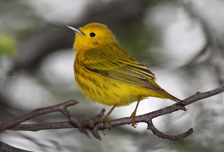
Yellow warbler, tail hidden, not useful for field guide

A field guide worthy photo, all relevant field marks showing


I’m happy to find raindrop-covered creatures for my rain book (Raindrops Roll, 2015). But that’s not so great for Jeff’s work on field guide photos. Raindrops reflect light, making the image spattered with polka dots. A smattering of pollen changes the color of a hummingbird—not so great for i.d.  If you show a photo of an animal with stripes of mud on it, people might think that it should always have stripes. Some of these variations can be altered in editing software. But, then again, should you show a leaf as is, with all the caterpillar bites in it? Or do you fix it so people won’t think that species of tree has every leaf “holey?” These are the questions that plague field guide photographers. What image will represent the species?

A photo of seagulls that shows preening behavior would make it seem, in a field guide, as though seagulls perpetually have rather awkward necks. Will you show the wren with a relaxed tail? Well, it just wouldn’t look wren-ish although wrens do sometimes put down that perky tail. So, judgments must be made.  Characteristic postures of a creature are as important as coloring.

The other thing is that the photos are keyed out, so it helps to photograph things on uniform, contrasting backgrounds. So Jeff carries around a flag-like piece of cloth which I sometimes have to hold, seemingly forever, behind a plant until the wind stops making the plant move so Jeff can get a good shot. This helps make sure all the needles on a tree will be distinct from the background. Yes, purpose matters. 


CHOICE OF VIEWPOINT MATTERS

Nonfiction authors and illustrators make choices. In my school programs I show kids why this is important in photography.  In the first slide I show them a broad view of the stunningly lovely wings of a polyphemus moth. Ooh! Aahh! the audience coos. Then I show them a closeup of a polyphemus moth face and its hairy, tarantula-like legs. Eeeuw! is the common response. Yup—same moth, same day, different angle. Photographers can make you fawn over an animal or fear an animal. It’s all in the visual choices we make. The same goes with writing. When you choose a metaphor, you are putting an image, albeit made with words, right next to your subject.  Say a spider just covers a medium pizza and people imagine that spider ON their pizza. That makes them feel a certain way. Excited or grossed out. Depends on the audience.

As a book author I often think in terms of a book spread and leave room for my own words/sidebars.

FRAMING MATTERS TO MEANING 

No, I don’t mean the frame around the picture although, yes, the setting of a photo in a book is important. (Book design impacts meaning.) No, I’m talking about psychological framing—the way we digest words and images. Framing is a tad deeper than the impact of viewpoint and metaphor I discussed above. This is a chewy topic for older grades. 

Basically, framing refers to the fact that words and photos do not live on a blank page that floats in space. A single seemingly innocuous image can activate a whole “frame” of beliefs/thoughts about a topic. Then, when you see the next word or image, you’re set up to believe it, not believe it, or take it in an entirely different way.  Just imagine your whole lifetime of experience with an image of a dark alley, a snake, an American flag, a robot, a baby-in-arms, and such.

 Here’s how one program describes the concept. 


Framing can be productive in good and bad ways. On the scary side, you don’t have to be directly insulting or racist or actually say someone is guilty. You just flash up an image or use a word that brings the emotions and thoughts of fear/guilt/protectiveness. Those previous images or words can totally change a person’s viewpoint of seemingly neutral facts or statements that follow it.  Alas, this kind of “framing” is very sophisticated. Its work goes quite below the radar even for people who are educated and think they control their reactions to things. It’s used a lot in political ads.

I’ll never forget the course I took at Duke: Media Power Politics. That brilliant, wild professor blew our minds.  He showed us how newscasts use music, color, lighting to make their newscasters look authoritative, how statistics can be manipulated for best impact in advertisement, how disturbing news images then lead us to the happy solutions—the commercials, where you learn that although you cannot solve war, you can smell better if you buy this soap. He showed us how the Nazis used patriotic films and images to set up the anger and shift the public’s view of certain groups.

Perhaps framing and media power politics don’t directly impact the way I take photos. But it certainly impacts how I read and watch TV. Being a savvy digester of images is going to be just as important as being a critical thinker about words if you care about nonfiction, now and in the future. The more students learn about it, the better they’ll be at sorting truth from manipulation. 

Next month I’ll be discussing some more aspects of photography, such as how to enrich photos with layers that give additional educational content beyond the main focus of the images.  (It’s sort of like what illustrators do with drawing or painting when they include extra symbols, words, and seek-and-find elements.) For now I’m going right back outside to see if I can photograph those warblers that were eluding me this morning. Good day, INK folks!
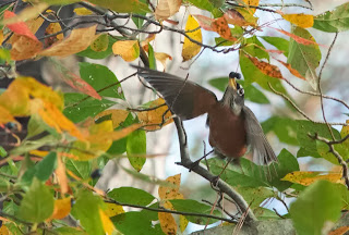
Sometimes a little blur can convey action.
Not great for field guide but good for  the feel of the scene.