#1 A galaxy with various nonfiction topics flying around
#2 An antique quill pen writing the I.N.K. letters on parchment
#3 Skywriting by a jet or an airplane pulling a banner
#4 An octopus holding up various books
#5 A fountain pen writing
#6 A takeoff on Roy Lichtenstein artwork, with thick black lines and colorful dots.
I didn’t get a chance to sketch out anything for the above ideas, but did try some (non-finalized) art for the next few concepts:
#7 Block letters with nonfiction topics inside

Still #7, but with color

#8 Book with various topics flying out.

#8 with color

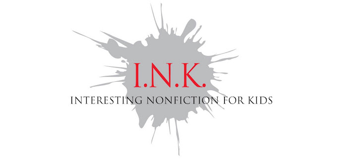
#9 Ink bottle and splat with topics

So, do you like any one in particular, or have another idea? Please leave a comment and tell us what you think... and any and all I.N.K. bloggers, by all means chime in!
Update: Thanks for all the good comments... here is another variation, I’ll call this #10 to avoid confusion.


18 comments:
Hello, you have Steve Freaking Jenkins as one of your contributors! I say he gets to either do it or pick what gets done. Maybe one of his Octopusses squirting "I.N.K."?
The idea that comes to mind immediately is a feather (quill) pen writing on a book. The quill pen represents writers, writing, and I.N.K. The book represents knowledge of all kind. I personally think the subject wording (history, science...) is unnecessary. I believe simpler is better.
If you're taking votes, I love the last one. It's simple and elegant.
Of those, I think I like the first and the third, but I also love the idea of the octopus holding books!
A clarification: by no means do I have to do the artwork... if one of the I.N.K. bloggers who is also an illustrator would like to contribute, have at it! I’m just trying to get the process started. : )
I like the last one (the ink bottle), too, but I also like the idea of a fountain pen writing. I think the list of topics is fine because it shows the breadth of the work represented here.
Thanks for getting the discussion started.
Of the ones you've presented, I like #8 without color best. Simpler is indeed better, so I'd be inclined to keep the topics out of the logo and streamline it.
I also like the last one although I think that they are all a little too complicated for a logo. I'd like to see some other artists weigh in.
I think TeacherNinja's idea of an ocupus squirting "I.N.K." is fabulous -- whether Steve Jenkins or someone else executes it! That having been said, I'd recommend being careful not to choose a logo that looks "too" juvenile, as a lot of the books you all highlight on this great blog are for older kids and/or teens (not to mention adults!). Of the samples you've presented here, Loreen, I like the ink bottle best because it's the most iconic. I think, though, that all of these concept drawings have one flaw that is EASILY fixed: The source of the I.N.K. acronym ("Interesting Nonfiction for Kids") is way too small. It's arguably the most important information being conveyed because it explains the entire focus of the blog. For that reason I would make those words bigger than they are currently and then assess whether or not the sub-headings make the overall design too wordy. I look forward seeing I.N.K.'s new look!
I like #8 or #9. I really like black and white. I don't know, but since print is usually black on white, I just think it fits. Also, some of the ones with color are just too fussy for me. So, that my 2cents worth.
I like #7, the first one! It's perfect.
Oh, the octopus, definately. Animals as logos are the best! (and they're nonfiction)
Unfortunately, too many people don't even know what an ink bottle is, or what it was used for. Seen any fountain pens around, lately? Neither have I. (Two points for anyone who actually knows what a fountain pen is and how to use it.)
Linda's Idea appeals to the historian/librarian in me, but again, how many people know that quill feathers were things you wrote with?
Whatever your illustrator comes up with will be great, I just know it. -wendie old
Glad you guys like the octopus idea. Anyone want to give it a shot? I also like #10 (but would vote for losing the subheadings as well).
I have to say, I like the very first one, #7, in black and white. It's clean and simple and clear, which I like. I also think that nonfiction is writing that's up-to-date, so the idea of a fountain pen or quill doesn't seem to fit as well as other ideas--for me, anyway.
Wow- you guys are so creative! What fantastic ideas! My vote would be #9- it really says ink to me! (Both a bottle of ink and Interesting Nonfiction for Kids)! Can't wait to see what you choose and to see it in action! Good Luck!
All the best,
Lori
www.loricalabrese.com
Many of these are brilliant. Thank you Loreen. I'm among those who like the last one best, but despite it's appeal I am also among those who think it would be best to avoid the list of topics because inevitably what will get noticed are the ones that are left out (the "etc." notwithstanding). The quill pen idea strikes me as a bit backward-looking (though fine for the history component of the blog). I'd look forward to other ideas.
I find it very hard to vote on just an idea, I'd have to see an example of the first few that were just words. Like the Octopus idea.
I see a lot of people like #7, it's okay but I like the ink bottle idea. Perosnally I think a variation on #10 in black and white would be great.
I'm a reader and home educating parent, and I like the ink bottle versions best, and the b/w version is so beautifully simple and graphic. To me, they say "ink" loud and clear, and much as I prefer the quill pen, I know today's kids will want something a little less fusty and old-fashioned.
Post a Comment